Client
Alphaus Cloud
Year
2025
Team size
3
My role
Product Design
Impact
Improved prioritization of actionable recommendations for technical teams.
Activity log ensures alignment across multiple users.
Prioritized shipping core features by deferring complex preference system.
Project context
Octo's recommendation listing problem
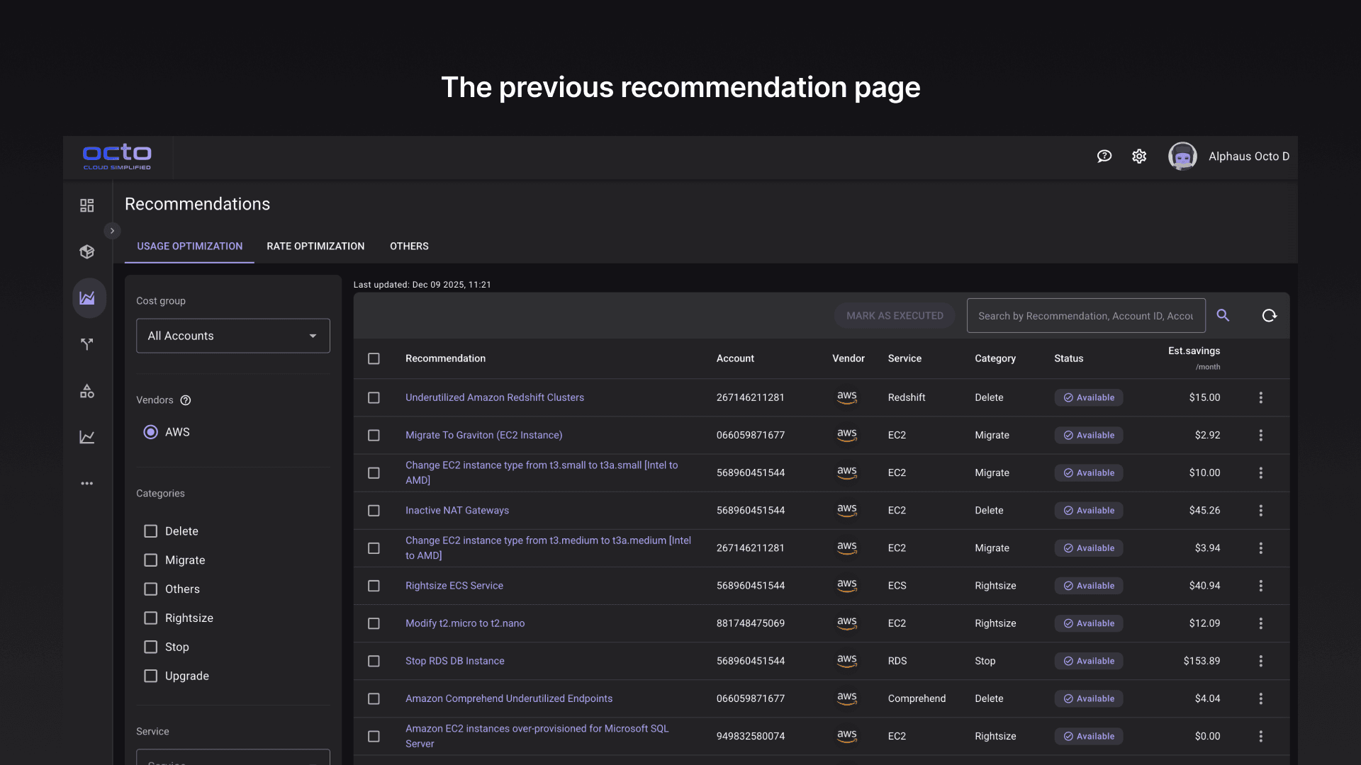
Octo’s optimization recommendations identify cloud resources that can be resized, deleted, or optimized to reduce cost. Enterprise accounts generate hundreds and even thousands of recommendations, overwhelming teams and making selection and filtering optimization strategies difficult and time consuming.
Scope
Designed the recommendation page to help users filter, prioritize, and track hundreds of optimization suggestions. Introduced risk/effort filters, side-by-side comparison (deferred to later phase), preference suppression, and an activity log.
Competitive research on recommendations
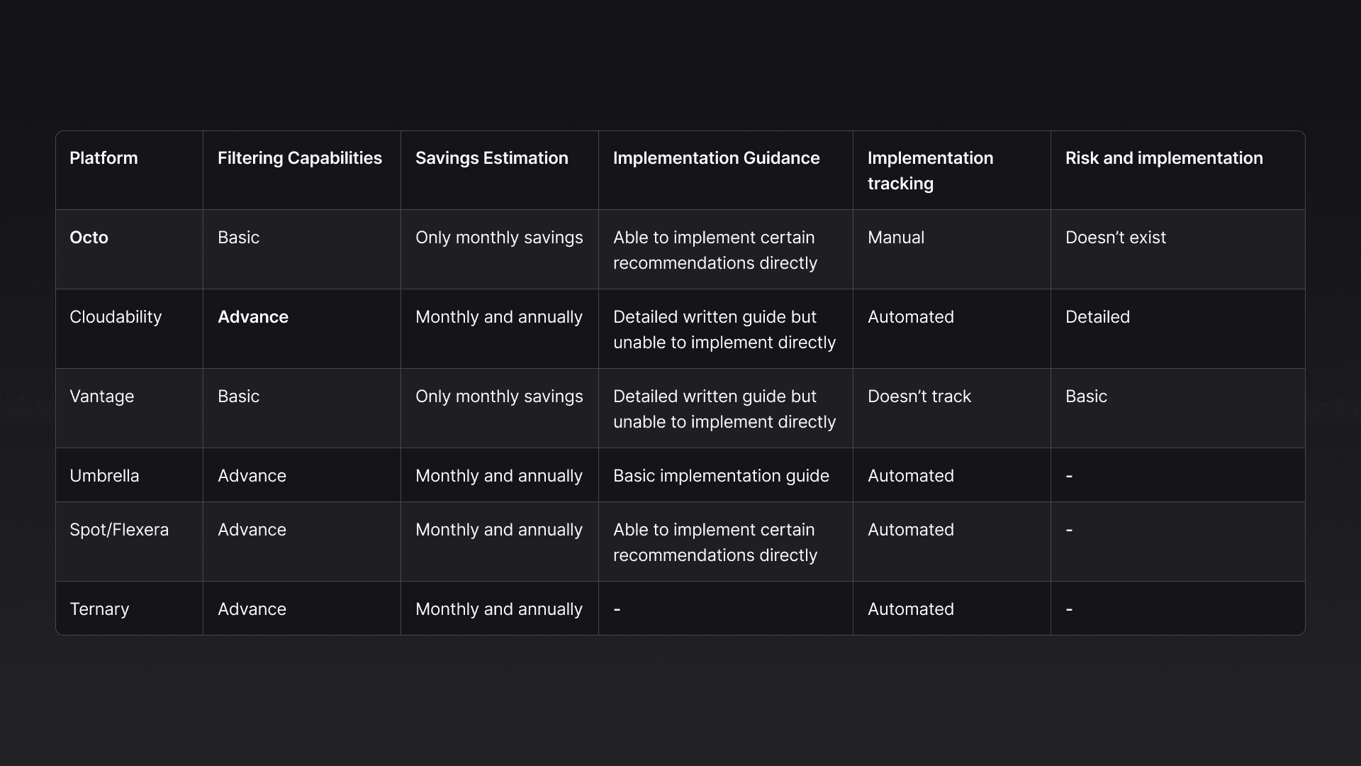
The analysis process is done by going through each competitors' technical documentations which easily reveals how they solve the problems through their UI and I was able to take these as inspirations for my prototype.
Diving into technical documentation
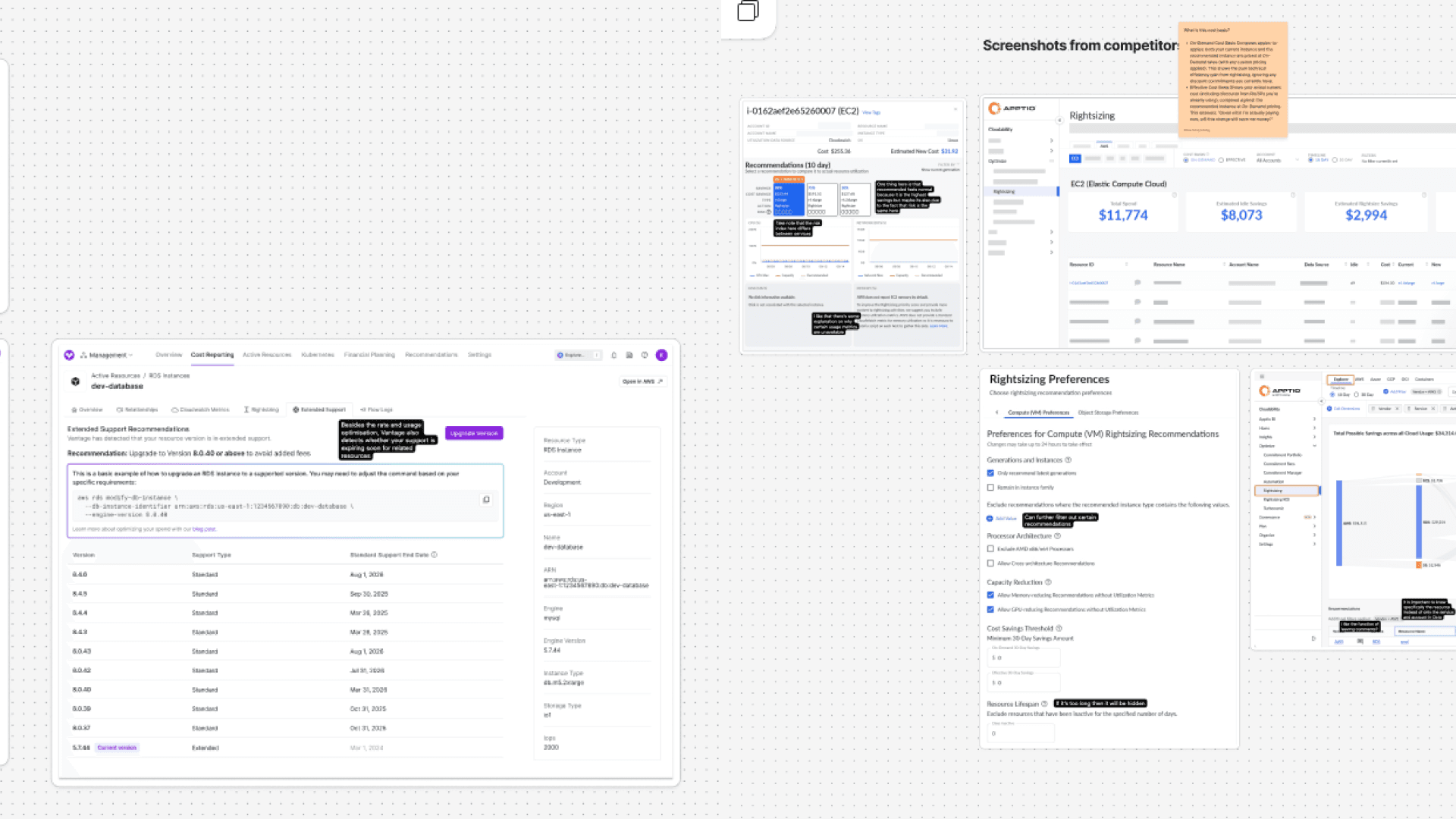
Beyond comparing interfaces, I studied each competitor's technical documentation to understand how their recommendation engines work. This research informed whether building our own analysis engine was technically feasible.
Key takeaways:
Octo’s optimization features are comparable with competitors
The features mainly lacked the depth to compete with others and offer true value
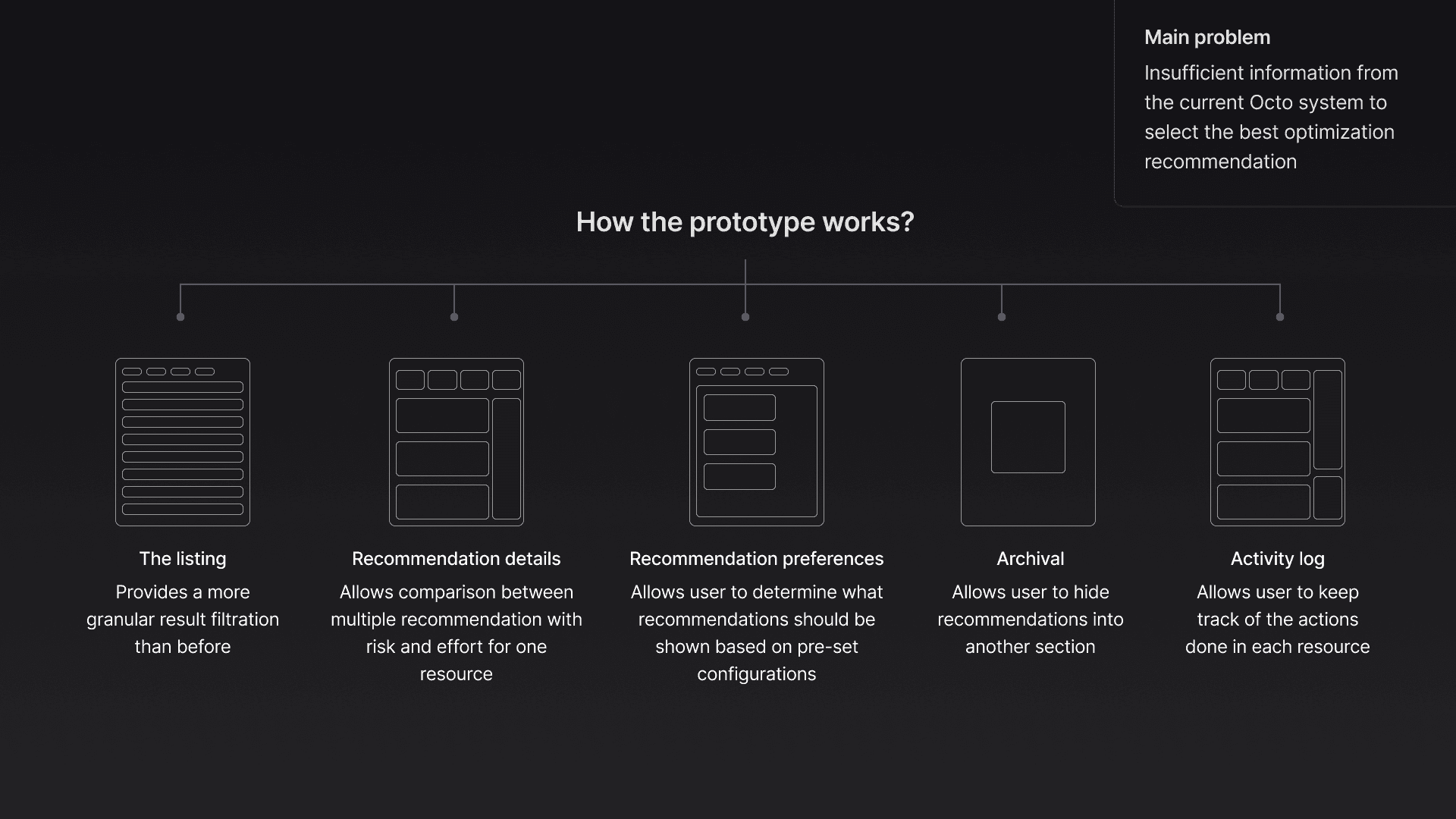
Creating the prototype
Help users understand, plan, prioritise and execute their optimization better
Design iterations
Tradeoffs I made in the Final UI
Recommendation listing
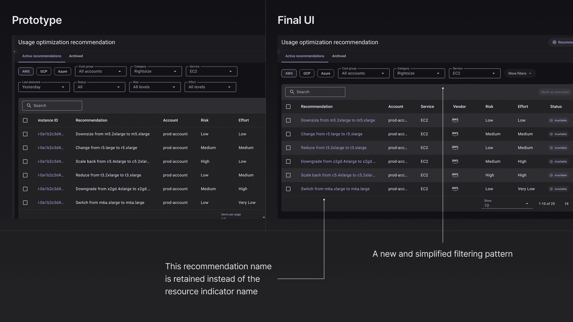
Prioritizing feasibility and shipping speed over creating a perfect recommendation system
Grouping by resource required significant engineering work—each cloud service names resources differently, requiring custom table configurations for hundreds of service types. I moved this to a future phase so we could launch the core prioritization features faster. Additionally, I streamlined filters to focus on high-value options while maintaining future extensibility.
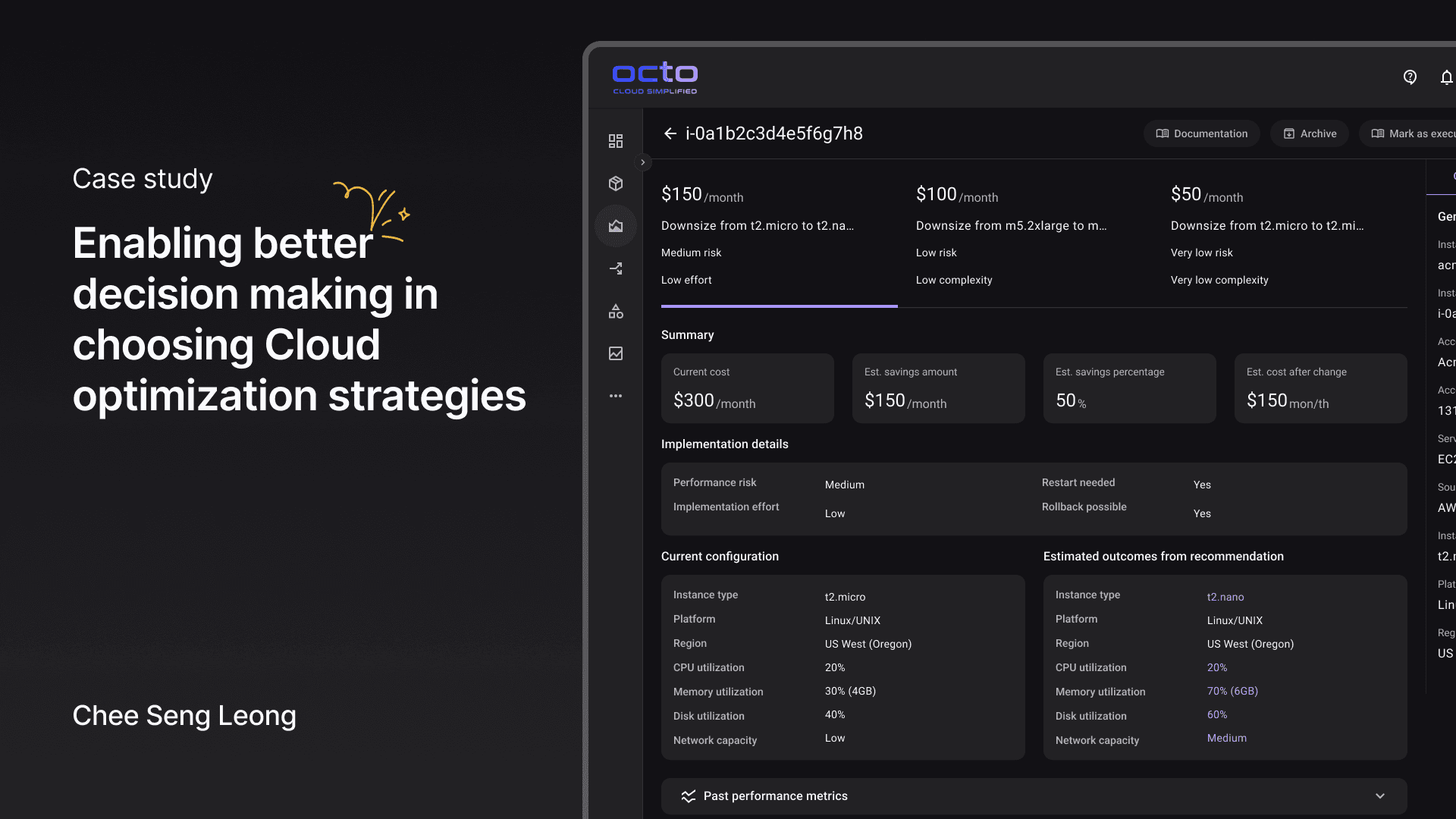
Recommendation details UI
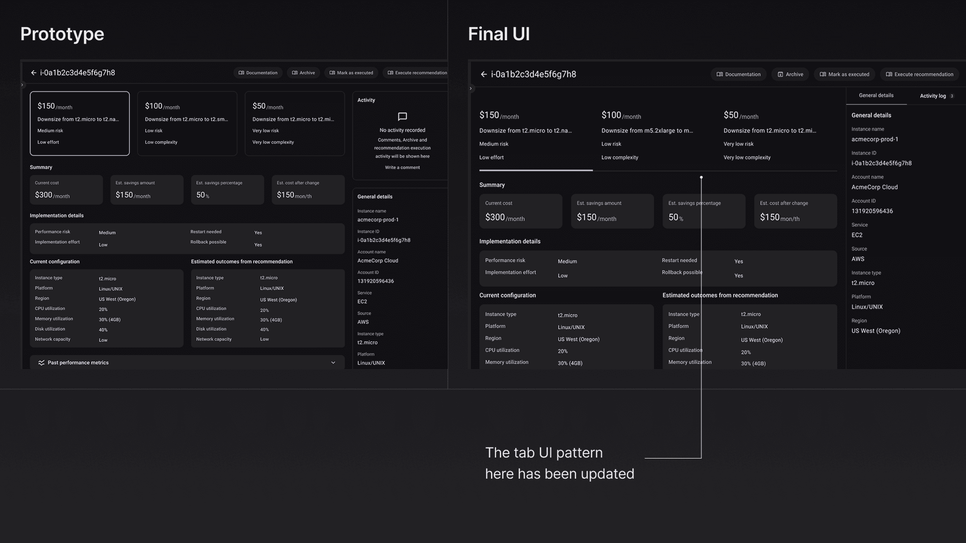
The prototype used card-style boxes to display each recommendation option. During testing, users didn't realize that clicking a card would update the details below—the box structure made everything look equally clickable, obscuring the relationship between options and content.
I replaced the cards with a standard tab pattern. Tabs clearly indicate that selecting an option changes the content underneath, making the interaction model immediately recognizable.
Removing the comparison mechanism for the 1st release
Testing showed users valued the side-by-side comparison feature, but I prioritized shipping the core details page first. Building comparison required additional engineering work to handle edge cases—like resources with only one recommendation or mismatched data structures across cloud providers.
On the other hand, I recommended the team to include new metrics like performance risk and implementation effort. These update could still help with decision making for the users.
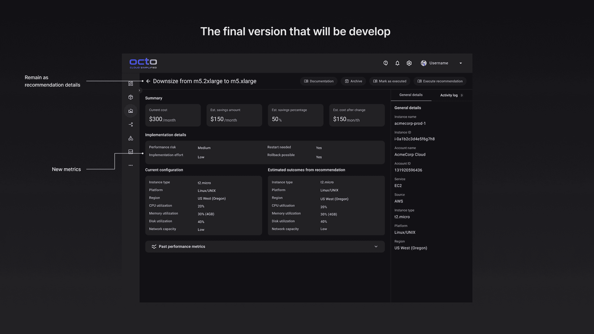
Activity log with expanded layout
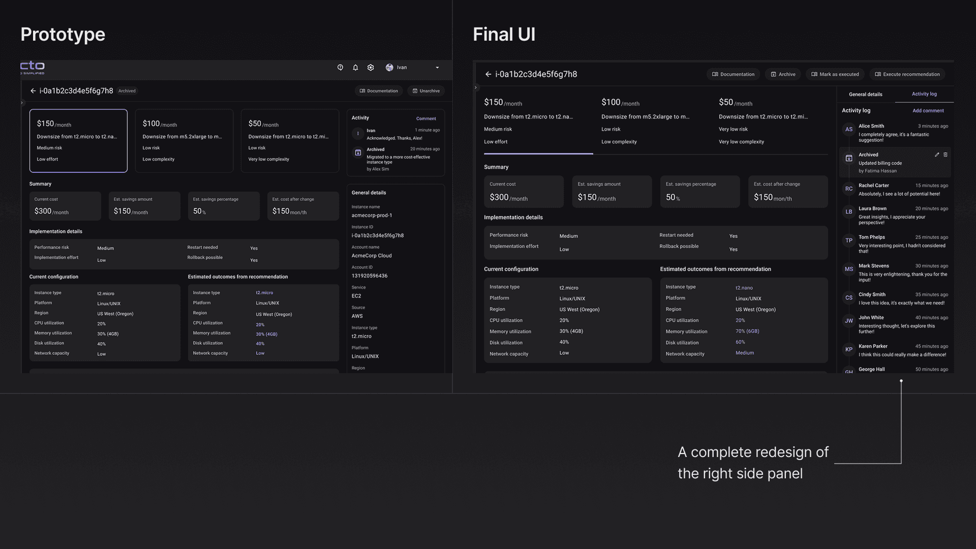
Testing validated that users needed the activity log to track decisions made on each resource. In the final design, I expanded it from a narrow side panel to a full-width layout with clear visual separation from the main content.
General details appear first since users need to confirm which resource they're looking at before reviewing its history. The expanded layout also gives more room to display detailed activity entries without truncation.
Deferring recommendation preferences capability
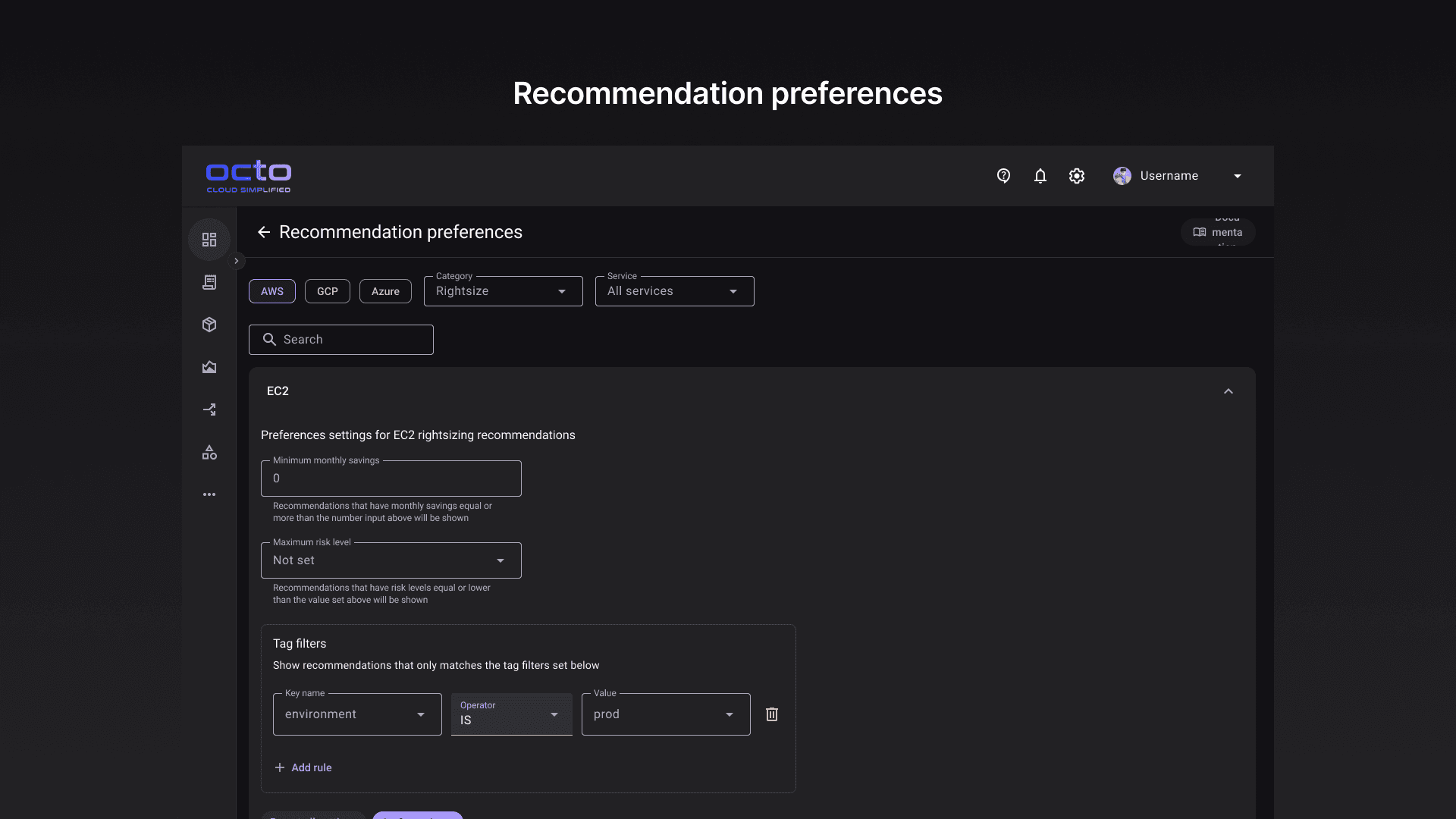
Recommendation preferences proved too complex to ship in the first release. With hundreds of cloud services across AWS, Azure, and GCP, building a preference system that's both flexible and usable requires more research and design efforts.
I'm currently working with engineers to design a simpler version that solves the core use case—letting users hide recommendation types they'll never use—without overwhelming them with options.