Client
Alphaus Cloud
Year
2025
Team size
4
My role
Product Design
Impact
Enabled 2 POCs; adopted by 7 internal users.
Expanded cost data types from 1 → 4, allowing non-technical stakeholders to interpret reports.
Streamlined report generation and improved executive-level budget visibility.
Project context
Insights report's challenges
Octo is a Cloud cost management platform for enterprises. The insights report lets engineers generate customizable cost reports for different stakeholders.
Prior to redesign, engineers spent hours manually reformatting reports; executives lacked high-level insights.
Scope of work
Led the end-to-end redesign of the insights report. I introduced a new way of building insights report with new widgets, report templates tailored to different personas, and many more. Throughout the project I collaborated with engineers to balance feature complexity with feasibility. This project took around 3 months to be completed.
Initial ideas and prototype
Not having enough widgets or data for reporting
The team had an assumption that insights report wasn't performing due to the lack of widgets variety. After all the report only allowed users to either present in a fixed format or from scratch. This led to the initial prototype that offered more widget variations in a fixed report format. I aimed to find out whether having more widget variants would help companies not only speed up report creation but make it more comprehensible to non-technical people.
Retaining familiar patterns while introducing new widgets variants
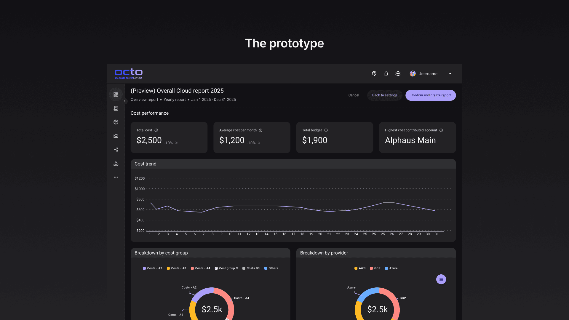
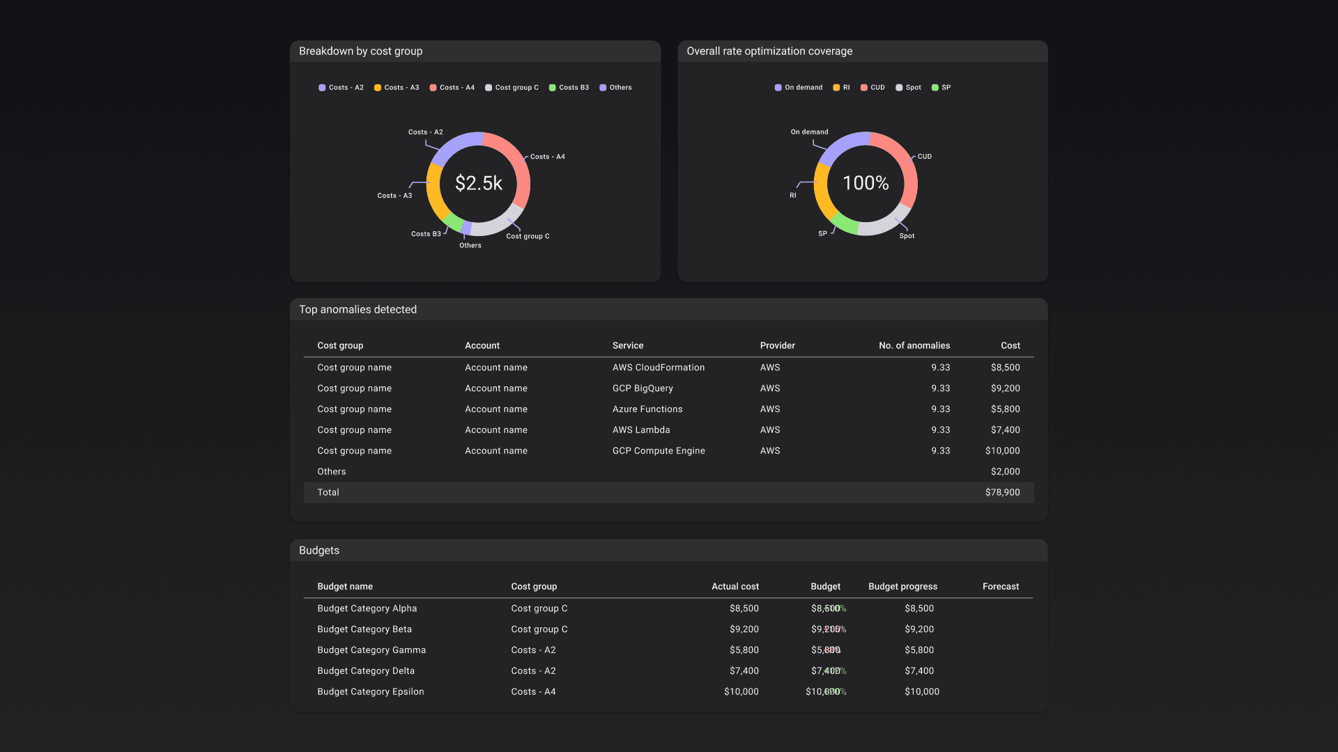
Fixed report meant that user couldn't edit report layout or swap the widgets that were placed there. It was designed to serve both technical and non-technical folks in the company. The report was made up of both chart and table widgets for deeper analysis when needed especially for engineers.
Demo video of the prototype
Key insights from testing
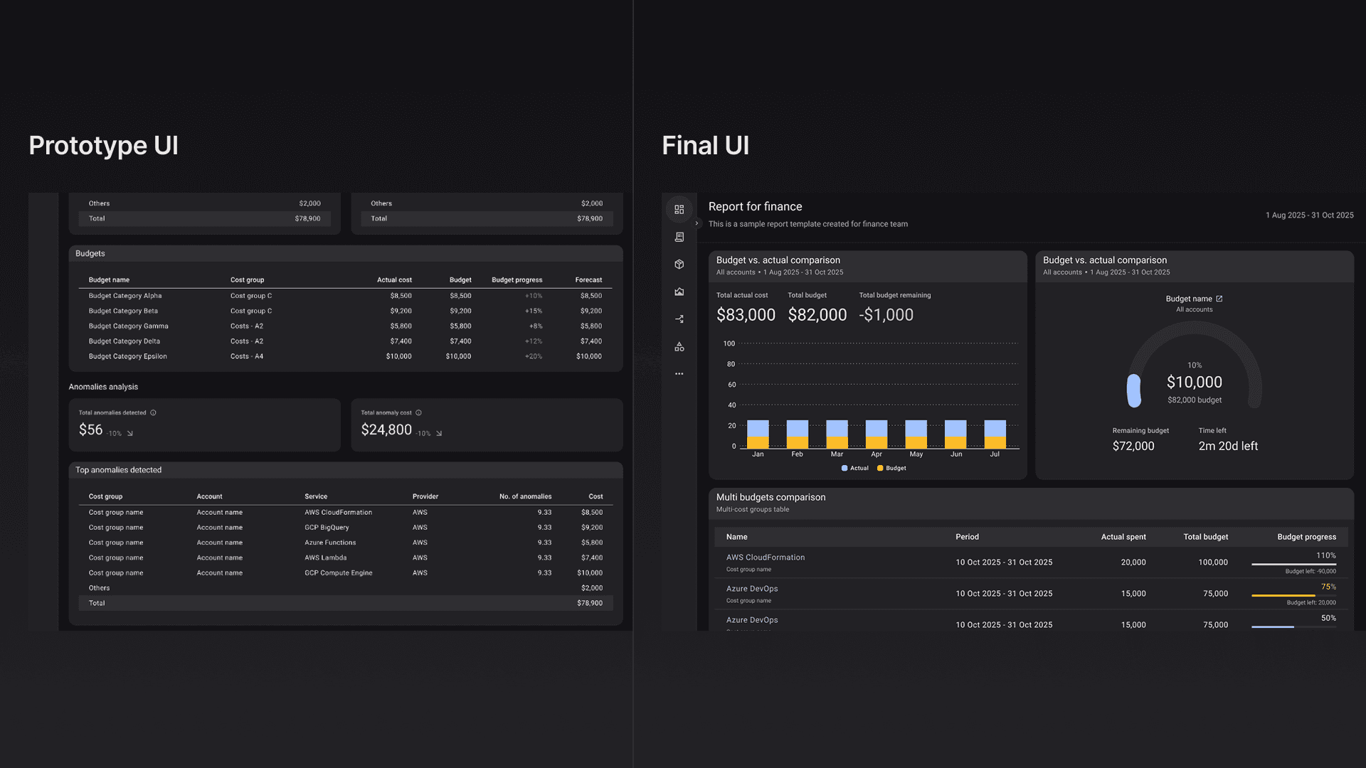
The fixed format report was too engineering heavy
Though useful for operational work for engineers. Users mentioned that the report was too dense for executives, who needed high-level information (e.g., "are we within budget %") rather than detailed cost breakdowns shown in table widgets.
Introducing more widget variants should be looked at more holistically than just selecting different variants
Having more widget variants were good generally as users had more flexibility to express different cost data but this meant that the old way of widget selection and report customization needs to be completely rethink.
Visual and interaction design
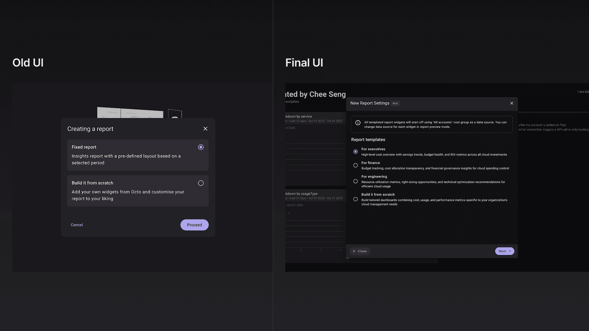
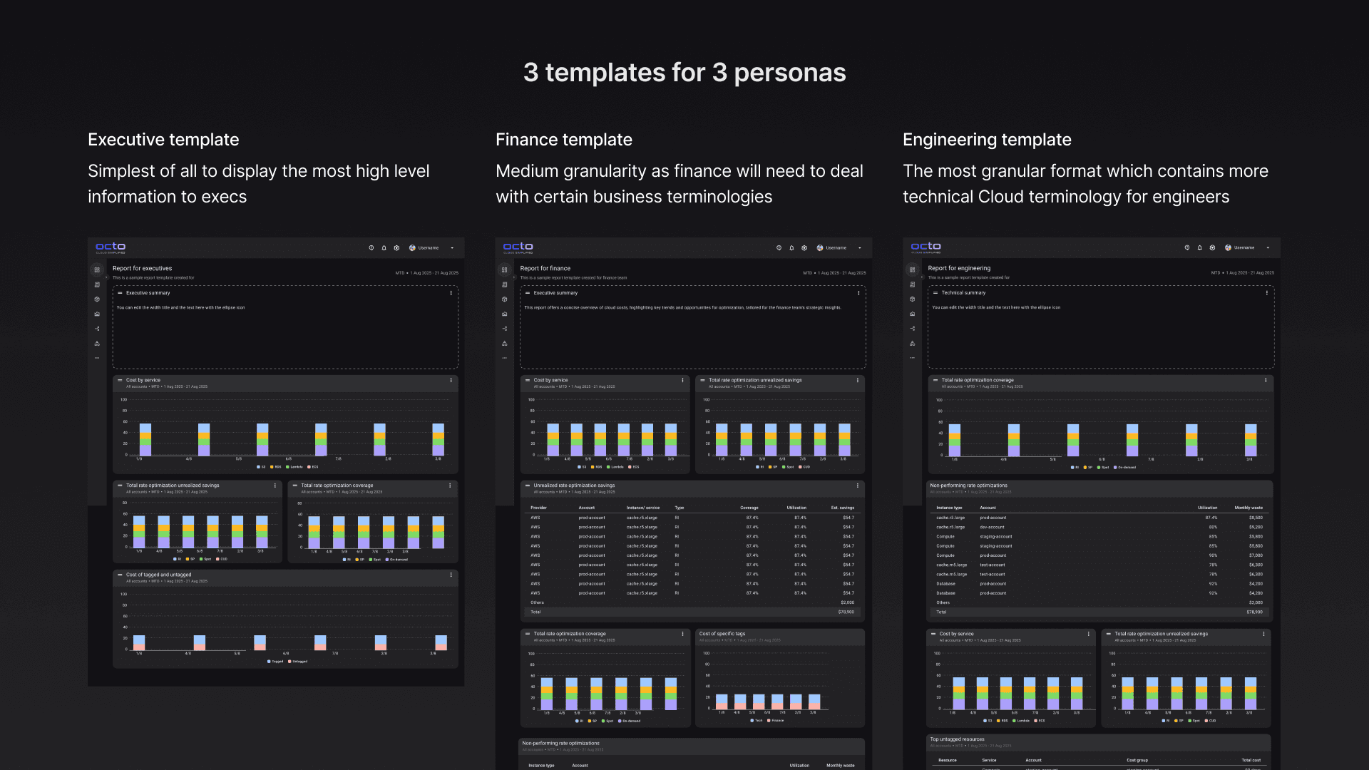
Persona-specific report templates
Prior to introducing the templates approach I experimented with how user beings the reporting process because the original flow starts with the user choosing between fixed format and starting from scratch.
Some archived explorations of the report template selection
I tested with a grid format initially but ultimately fallback to the listing approach as I don't want to create a an entirely new component in the system at the moment if there was not a huge improvement in scanability.
Easier to start and customize further when needed
With templates users would not be limited to a fixed format. They also had the ability to remove or add new widgets when necessary; making the entire reporting experience flexibility and efficient.
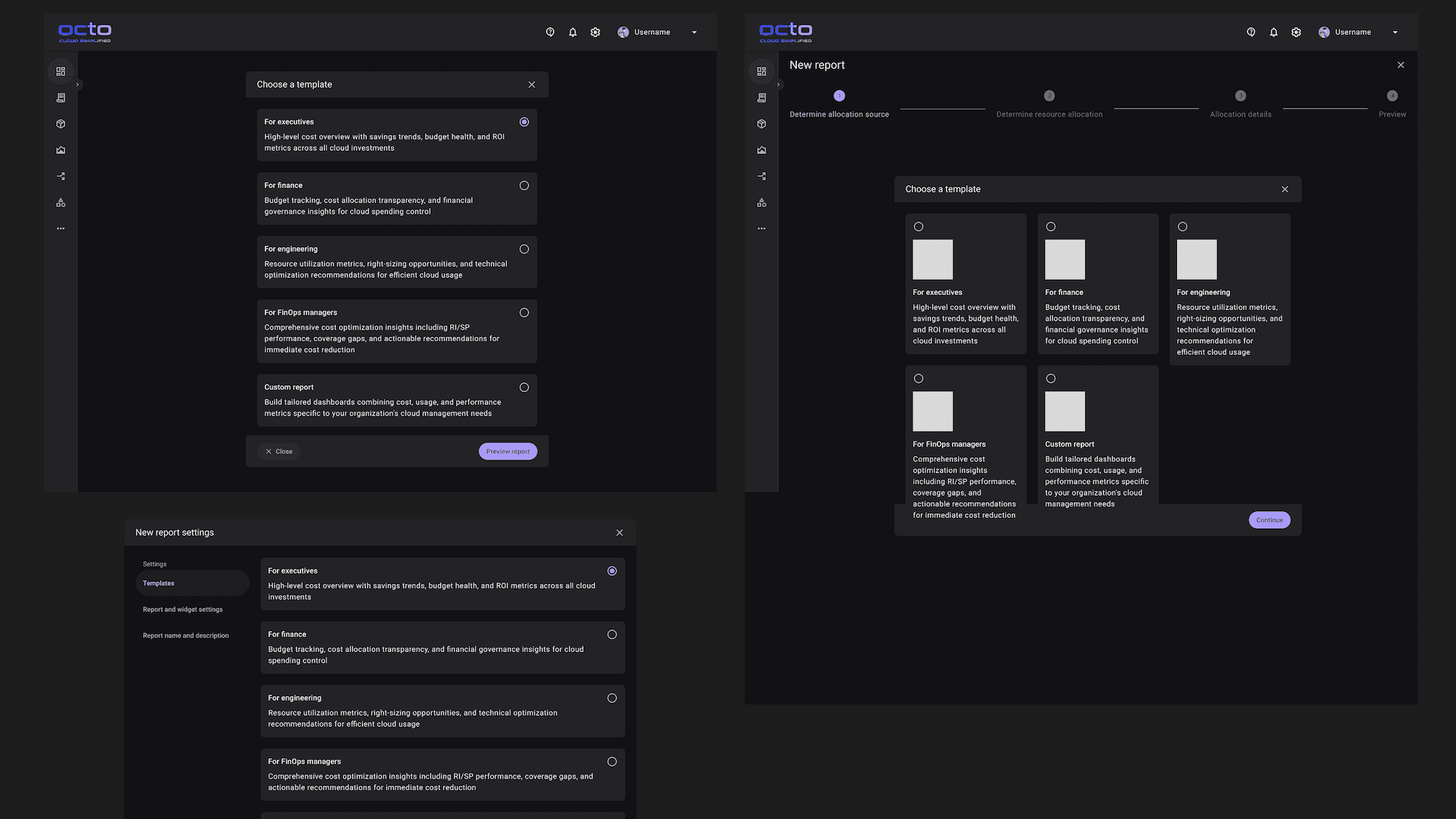
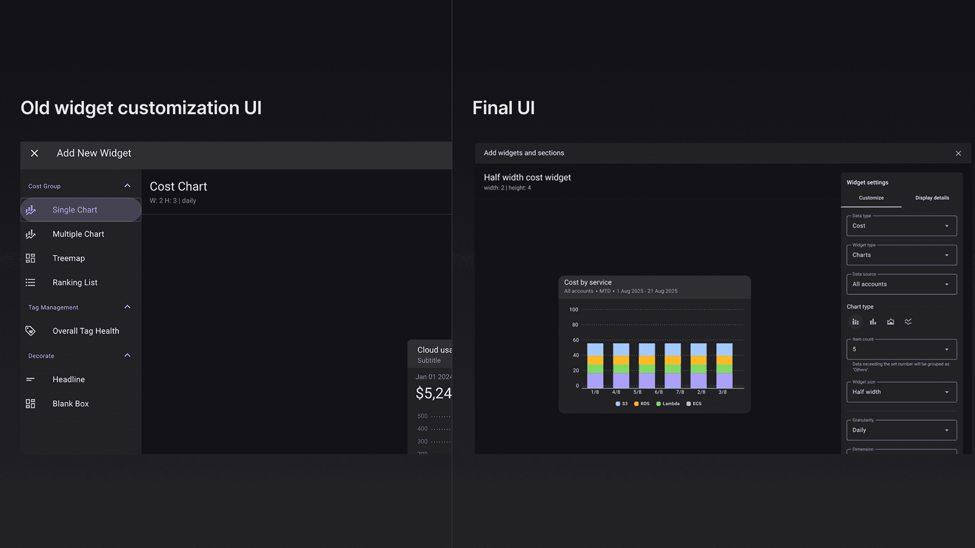
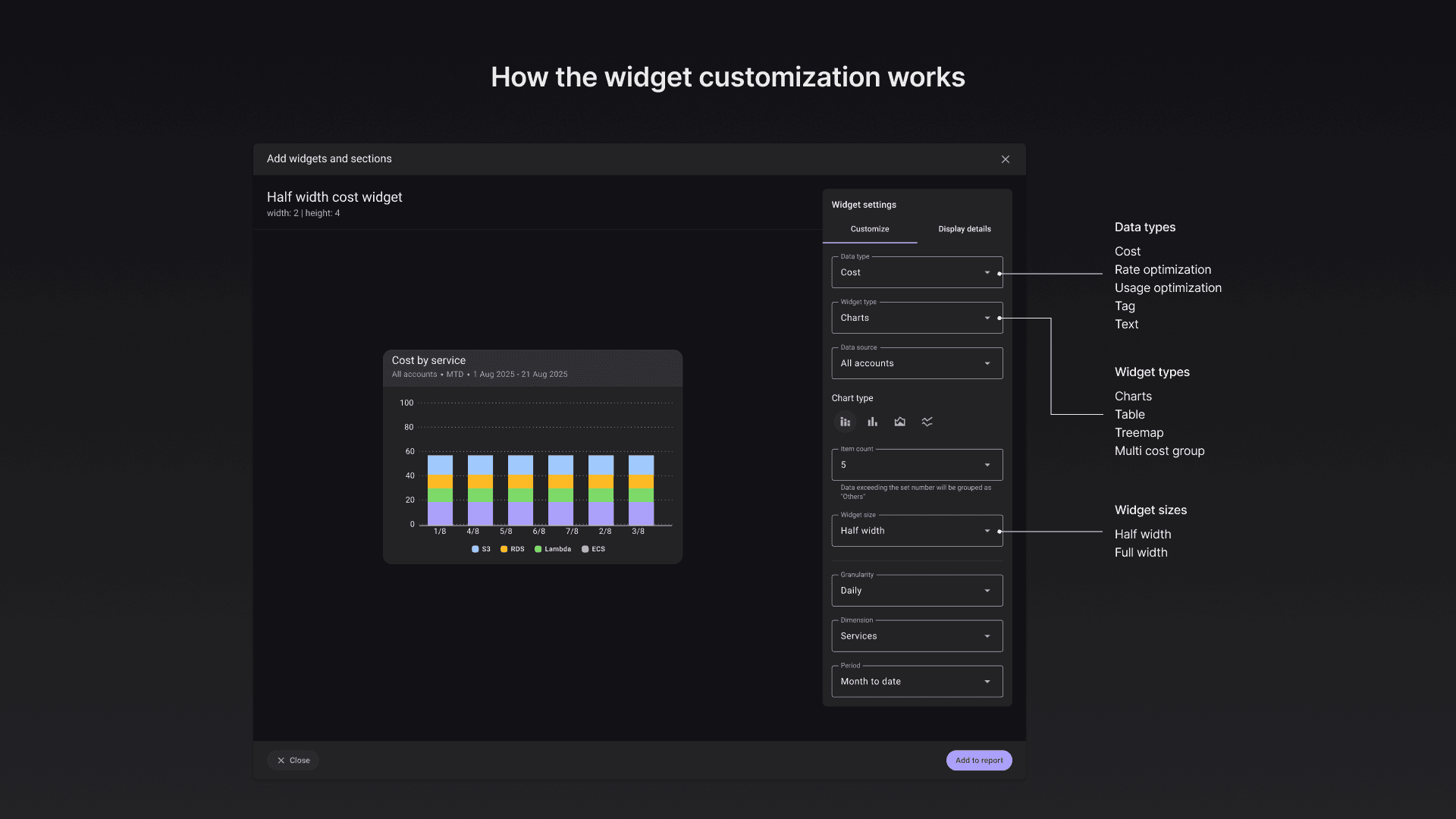
An entirely new widget customization experience
I needed a solution where user could customize the widgets instead of only choosing from a list like the old design. The challenge was that I needed to balance how much could be customize if not user would be confused by the options itself which would be counter-intuitive.
Some archived explorations of widget customization
Below you would noticed that I was experimenting with information granularity customization. This meant that users would be able to adjust how detail they wanted the widget to be for one metric. From a single number to the most granular which was a table.
Additionally, I tested with several widget customization interaction like placing the filters on top, at both sides or only having it on the right side.
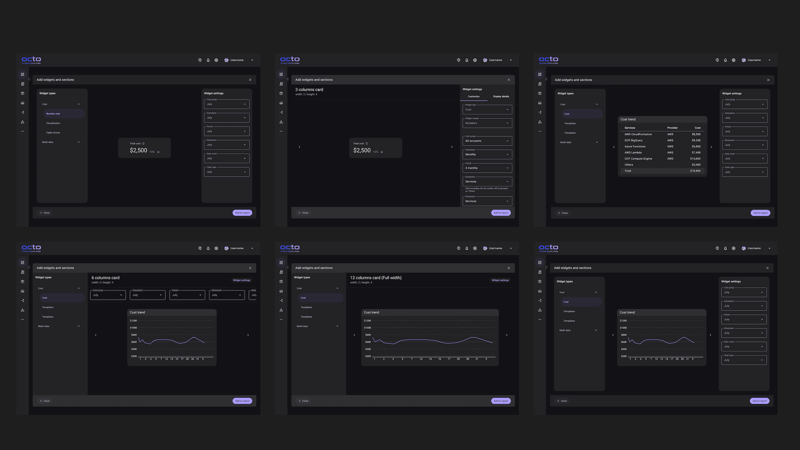
Ultimately I landed with the one below which was a huge almost fullscreen dialog box with the customization panel on the right. I separated each customization segment with a subtle divider so that the visual separation made the interface less overwhelming and easy to use.

Interaction designs
Another portion that was challenging and fun was designing the interaction of placing widgets and moving them around in the edit mode of the report.
Placing the widgets
Originally, I designed widgets to appear directly on the report when added, with users repositioning them by dragging afterward.
Feedback revealed this forced users into a two-step process—add first, then move. Instead, I let users decide placement upfront: they'd drag widgets from a container directly to their desired location on the report.
This introduced a new problem: users wanting to place widgets at the bottom had nowhere to drop them. I solved this by adding a small empty space at the bottom of every report template when in edit mode, giving users a clear drop target.
Moving widgets around the report
Designing widget repositioning presented a complex challenge. Initially, I envisioned automatic repositioning when widgets were swapped horizontally/vertically or removed—widgets would flow into place seamlessly.
I prototyped this interaction in my development environment, but testing revealed the automatic repositioning created more problems than it solved. Widgets would sometimes position incorrectly, making the system unpredictable and harder to manage.
Swapping widgets horizontally or vertically worked reliably, so I kept that behavior. For removal, I replaced automatic repositioning with a manual "tidy up" button. This prevented messy layouts while keeping users in control.
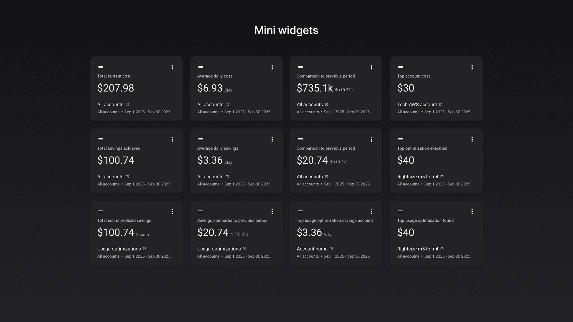
Ideas that were expanded after shipping
Prioritized features for internal POCs; deferred mini-widgets to maintain focus and speed.
There were a lot of ideas explored but didn't make it into the 1st release. Some of the cost type were also not included as I was aiming to ship it as fast as possible for POC so that I could get actual feedback quickly and work on the next iteration.
Below were some of the newer designs being explored after getting feedback from both the team and from the POCs.
Mini widgets
Budget widget